Two Eye Characters
Two Eye Characters is my first letterpress project.
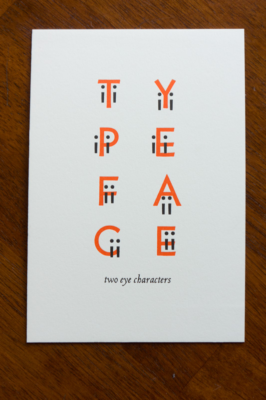
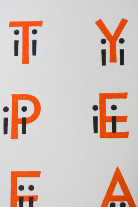
The uppercase letters and the Is are Bernhard Gothic. The title is Arrighi.
As I’m still very much a beginner, I kept the design pretty minimal. I had mocked up an entire alphabet of characters on the computer in half an hour or so, but quickly realized that setting 26 unique characters would be very difficult. Eight seemed more reasonable, while also providing the chance to sneak in another pun.
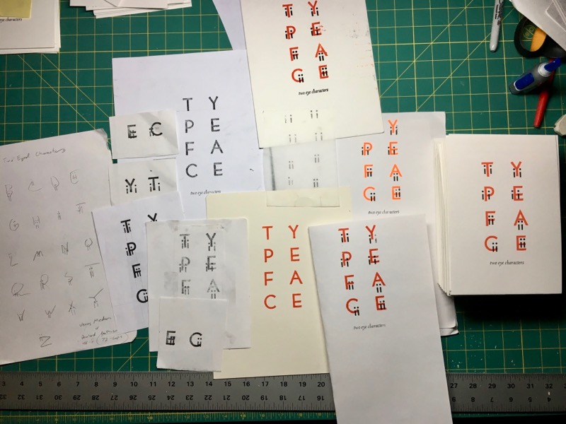
Iterations
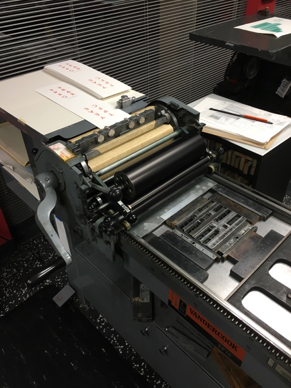
These were printed on “Voldemort”, a Vandercook SP-15 cylinder press at Seattle’s School of Visual Concepts. There were two passes: first the orange uppercase letters, followed by the Is and the title. Still, aligning the Is with the uppercase characters was no easy feat, as evidenced by the lockup.
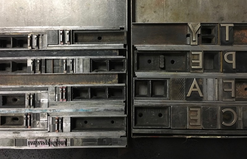
Only 70% of the prints or so were even salvageable, for which the blame clearly must rest on our Dark Lord and not with yours truly (who undoubtably executed his first printing quite flawlessly.) Sometimes Voldemort failed to align the paper properly, and other times he let the paper flop about and get all covered in ink. It was really quite trying to work with him.
There’s also some variation between individual prints. Shift the Is just a point or two in any directions, and the character’s expressions end up very different. No two prints are perhaps quite the same, but that’s actually not such a bad thing given the concept.
The final prints are 5½ x 8 inches on heavy cardstock. I made fifty prints total, of which 30 are already spoken for. You can buy one of the remaining 20 for $10 each over on Etsy.

