
Burn For Him
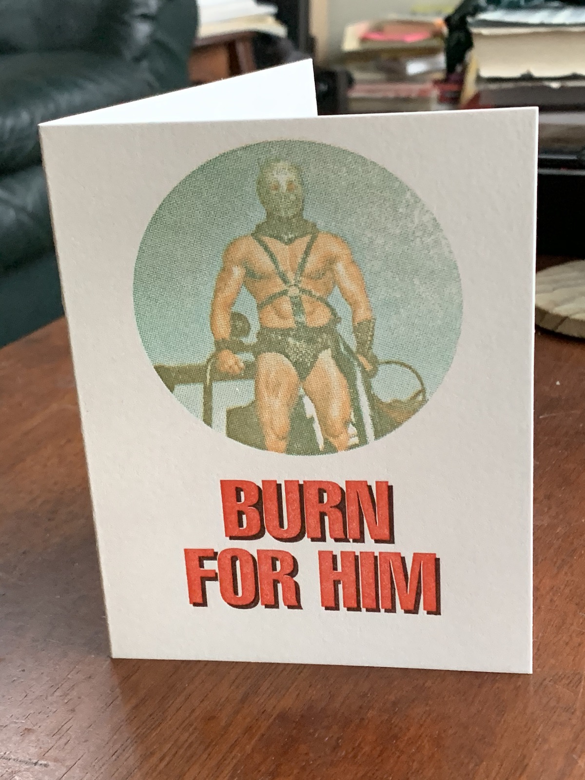
Burn For Him was my first attempt at printing a full color image using letterpress. I printed the card late 2019 for a class at Seattle’s School of Visual Concepts. I must have missed the memo because everyone else in the class made classy holiday cards with snowflakes and whatnot. I meanwhile printed Humungus.

Actually, Burn For Him was supposed to be an environmental themed card. You know, all about that sweet, sweet guzzolene. I’m only sharing the card all these months later though because right after I finished printing it in 2019, Australia caught fire. That made Burn For Him seem far more cynical than I ever intended.
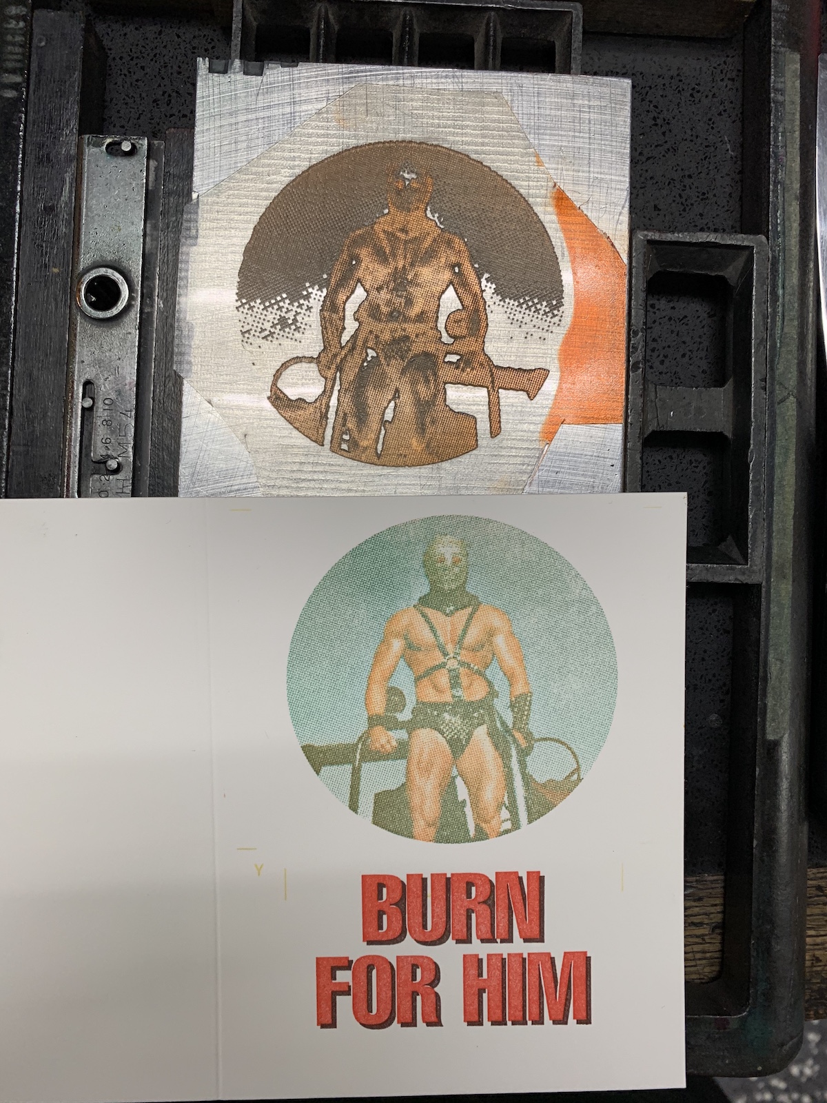
The main graphic was printed using three halftone passes with muted versions of the traditional CMY colors. I was going for a vintage magazine look and quite like how the modified colors and coarse halftones came together. Even my printing mistakes—such as not being able to exactly line up the three passes—add to that general aesthetic. The text was printed with laser cut linoleum blocks.
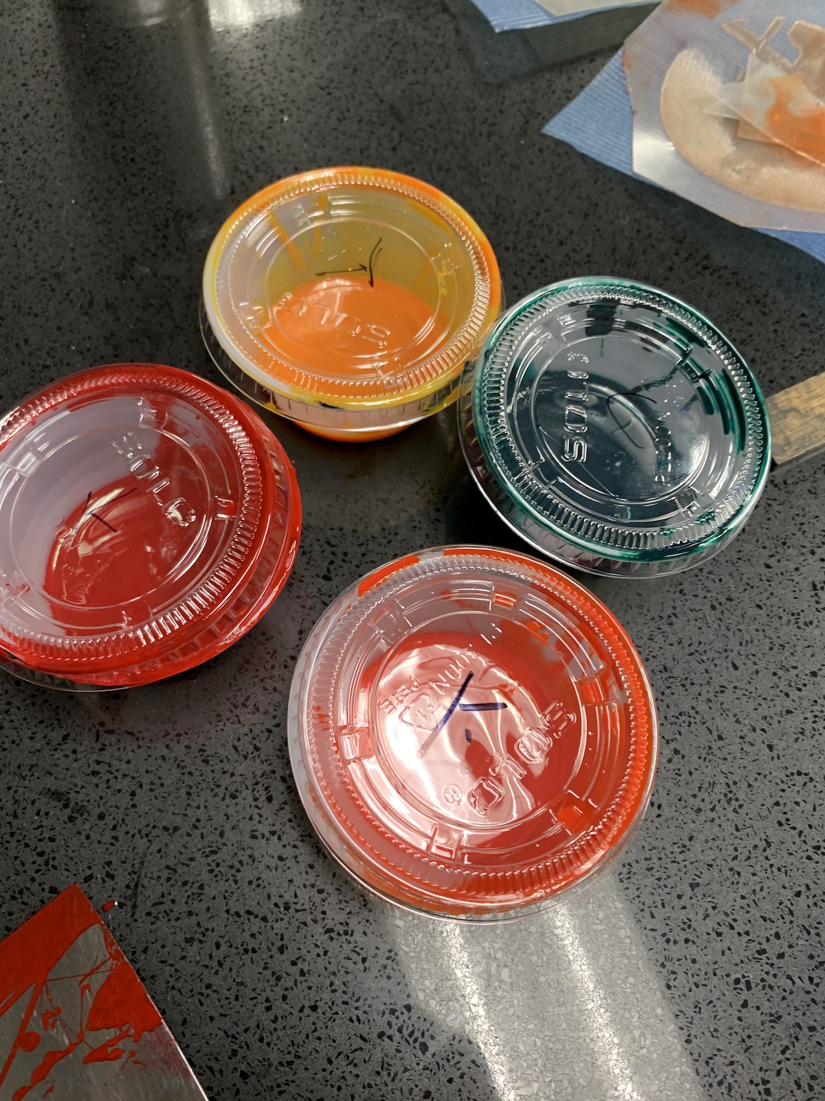
Modified CMY colors. I originally was going to use the darker red on the left as black for a fourth pass, but I liked the print better with just three passes.
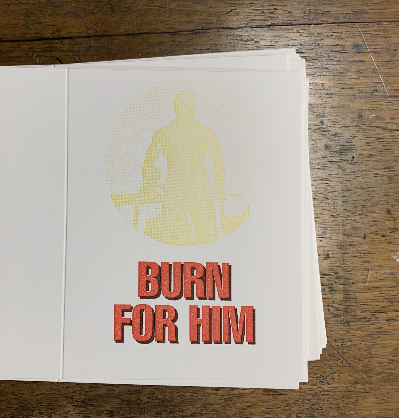
First pass (yellow)
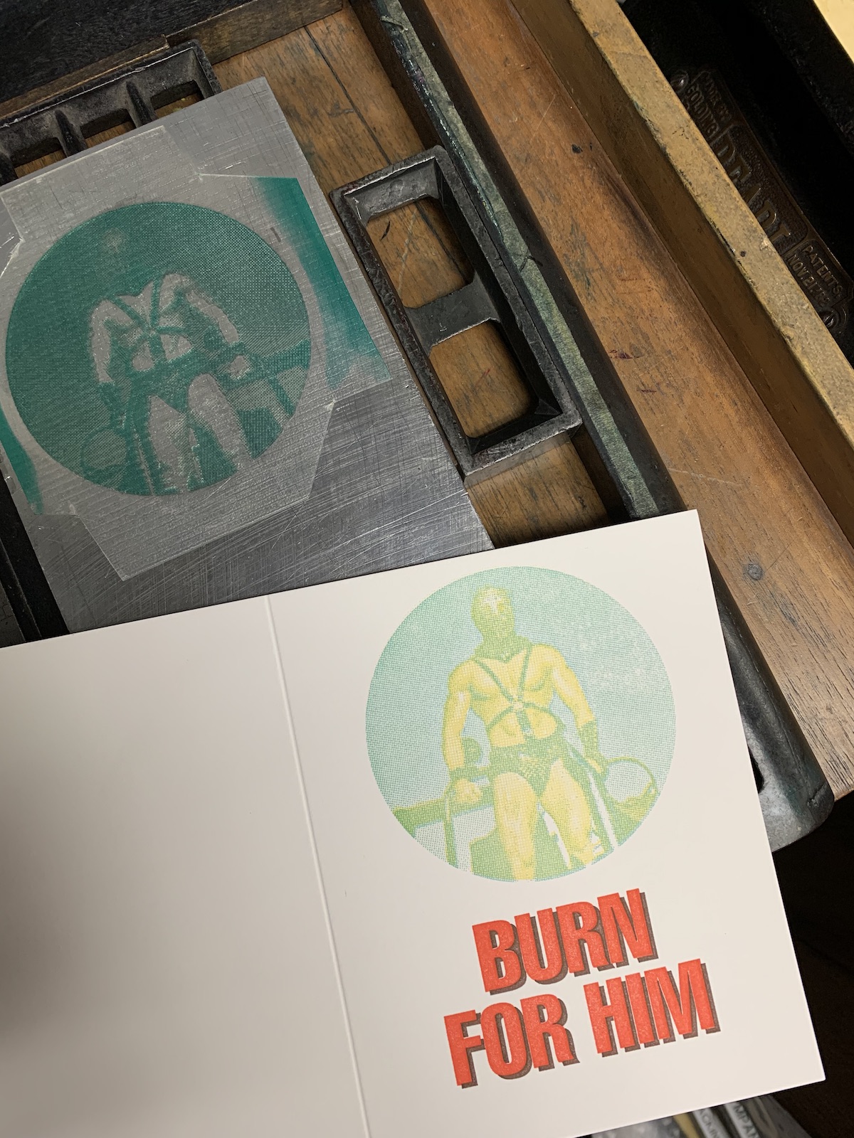
Second pass (cyan)
Third pass (magenta)
The printing process was fascinating. Until I printed the last color, I really had no clue if the image would turn out or not. And while letterpress is not the right medium for printing full color images, Burn For Him was a fun little experiment.